(Last updated April 2024)
Fields Section
The Question Design Editor provides a Fields section that will allow authors to add fields within each question to collect data. A field type represents the format of the field in which the data is entered.
There are six basic categories of field types available for use in Questions:
-
Text Fields
-
Number Fields
-
Date Fields
-
Gender Fields
-
Radio Buttons
-
Check Boxes
In this section we will discuss how to add a field to a question. In addition, this section will describe each of the field types and the properties which must be defined for each type. A reference chart of the field properties and field types follows.
Note that a field type is not the same as a variable type, which defines how data, once collected, should be treated. So, for example, a number field provides a convenient format to collect a special number, such as the “number phone” field in A2J Author®. However, a text type variable will be used in association with the number field in this case, because, a phone number, while it is a number, will not be used to perform math calculations and should therefore be a text type variable. A number variable type is only used when planning to use that number in calculations.
Adding a Field
To add a field to a question, select the number of fields to add under the Fields Section of the Question Design Editor (figure below). You can add up to nine fields per page.

Figure: Add up to nine fields per page.
Once the number of fields to be added has been selected, the field editing box displays (figure below).
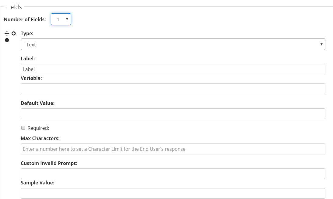
Figure: Field Editing Box
There are a number of different properties for each field type. All field types, however, require that the type, label, and variable be defined; and, most field types provide a validation selection. Other properties include: Default Value, Internal or External Lists, Max characters, Calendar, and Sample Value. Each of these property types are described below.
Common Properties
Each of these field types has a set of three common properties which need to be defined for each added field: Type, Label, and Variable (figure below). The field type must be selected from a drop-down list (figure below). A label, which will appear next to the field (usually to the left) in the Question, should be entered in the “Label” field, if desired (figure below). And, a variable name must be assigned to collect the data which will ultimately be entered by the end-user in the field during the Guided Interview (figure below). All of the previously created variables can be added to the Variable field by beginning to type the name of the variable. A2J Author will display a list of variables that matches the letters typed (figure below).
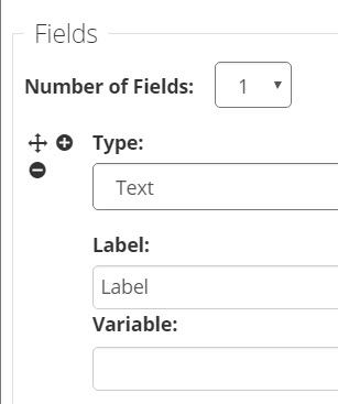
Figure: Common properties to every field type.

Figure: Field Types

Figure: Start typing the name of the variable and A2J Author will offer suggestions from the existing variable list to match.
Required
Most fields provide the option to validate the field to ensure that the end user has provided an answer. To do so, the author can set the field as “required.” If the author marks a field as required the field includes a "(Required)" label in red next to the field in the A2J Viewer. If the user doesn't provide an answer, the field will be highlighted red and A2J Author will warn them with a default warning that says "You must type a response in the highlighted space before you can continue." The end user will not be able to continue with the interview until the missing information is added to the appropriate field. The author can also provide a custom required warning by typing into the “Custom Invalid Prompt” field (figure below).
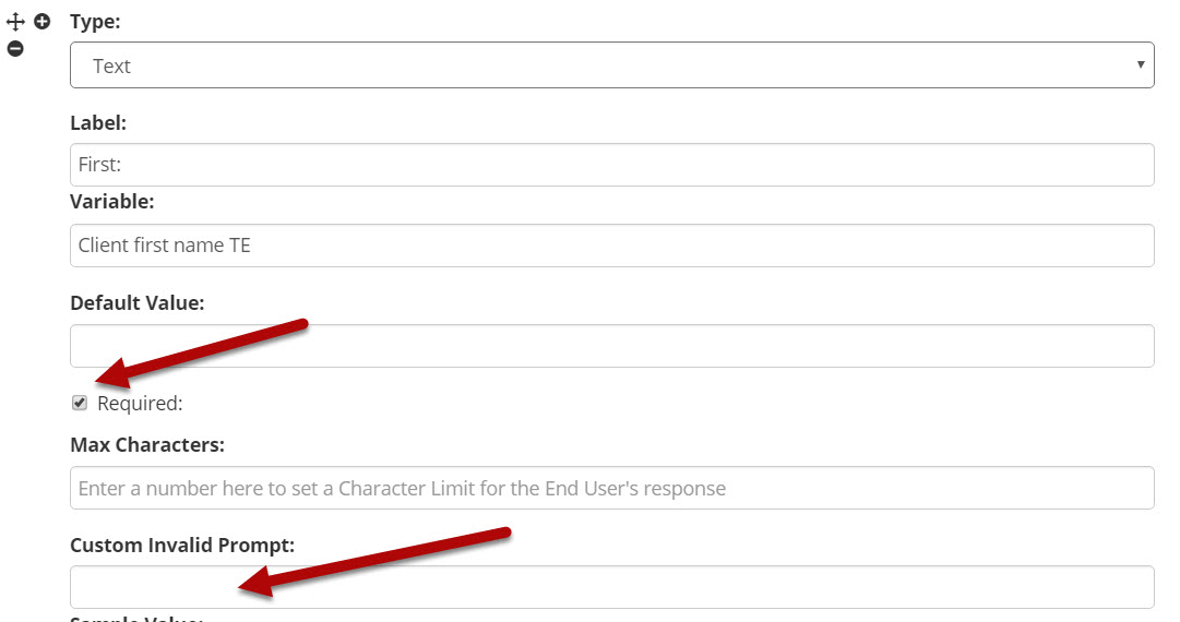
Figure: Required setting and “Custom Invalid Prompt” field.

Figure: A required field, as it appears to the end-user.

Figure: Default error message when end user does not answer a required field. Authors can customize this message if they choose.
Default Value
A default value can be set for most of the field types, except the Checkbox, Check Box (None of the Above), Gender, and User Avatar fields. While, the default value will appear in the field as a suggestion to the end-user, the end-user can enter an alternate value (figure below). This feature works well for routine information, such as county or state. Providing a default value in appropriate place increases the efficiency of the interview for the end-user.
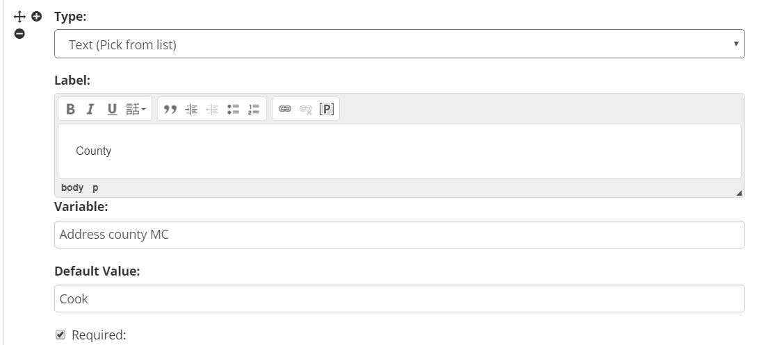
Figure: Default Value set to “Cook.”
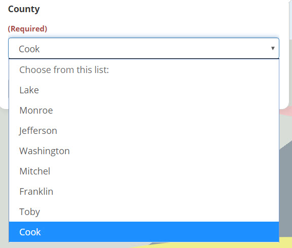
Figure: Default Value populates the field.
Internal or external lists
There are two types of fields authors can use to provide the end-user with a drop-down menu which includes a series of values: Text (Pick from list) and Number (Pick from list).The Text (Pick from list) field allows authors to design a custom internal list or attach an external list, while the Number (Pick from list) field generates the list based on the minimum and maximum number parameters set by the author.
To create a custom list, type into the “Internal List” box (figure below). After each option, hit a hard return (Enter key) to indicate to A2J Author that the new option has been entered. Leaving the internal list box will cause A2J Author to combine the list options into 1 text string (Figure 88). Don’t worry, the list options will still be differentiated for the end user (Figure 89).
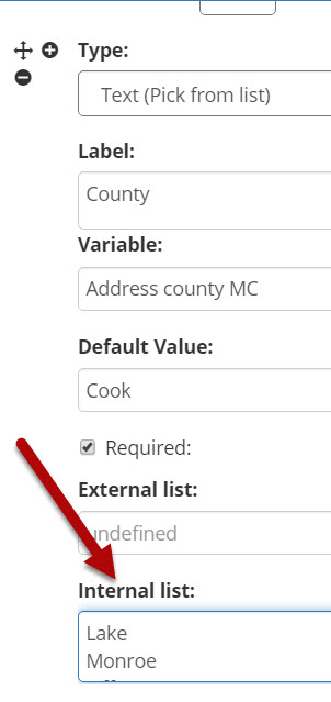
Figure: Internal list editing box.
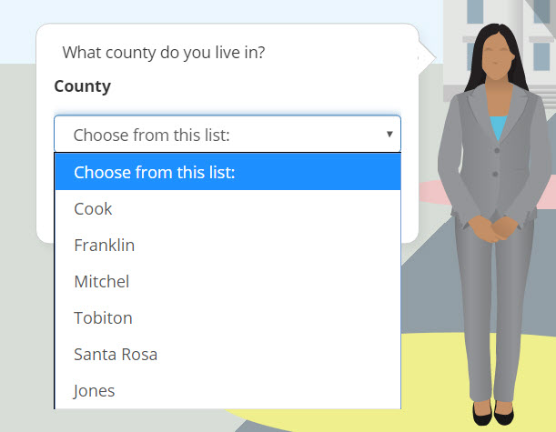
Figure: How internal lists look to the end user.
Alternatively, authors can attach a preformatted list from an external file. It must be an xml file. Under our New Author Resources we have a list of U.S. States that is preformatted to convert into the two character abbreviation for the state once it is assembled. The name of the file is US_States.xml and can be found here.
To attach a preformatted list, click the Upload button below the “External List” field. Then browse the computer files to find the appropriate preformatted list (Figure 90). Double-click on the name of the list to attach it to the field in A2J Author®.
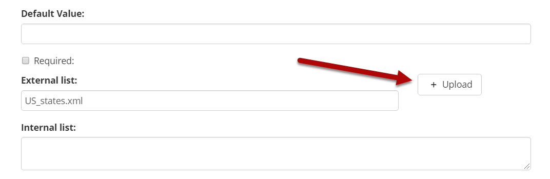
Figure: List from external file and US_States.xml preformatted list.
Max Characters and Limits
Author can restrict the maximum amount of characters that an end user can enter to prevent overfilling a field on a form. To do this, type a number in the “Max chars” field. The figure below shows that the end user cannot type in more than 15 characters because the author has set the max characters to 15.
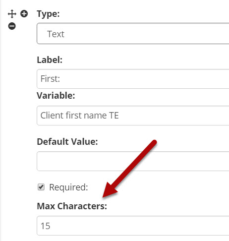
Figure: Max chars set to 15. End User cannot type in more than 15 characters to the first name field.
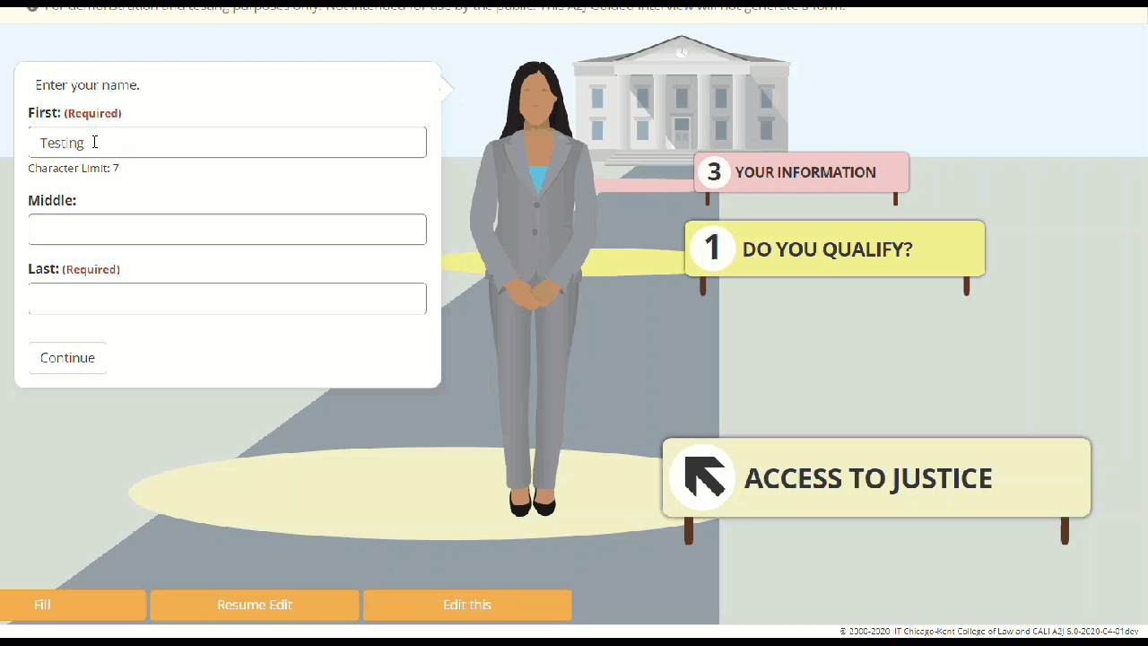
Figure: Max Characters set to 15 characters and end user cannot type in more than that in this field.
The author can limit date fields as well. The most common limit on a date field is “TODAY”. That prevents the end user from entering a date that is in the future if the maximum is "TODAY" or to a date in the past if the minimum is "TODAY". The author can also restrict the options presented to the end user. In the figures below, see that the date range is limited from 01/01/1950 to TODAY. When the date options are not limited, A2J Author will present the end user with date options from 01/01/1900 through 12/31/2050.
To limit a number list or date list to a particular range, set a minimum value and maximum value (see figures below). For dates, set the range using the format mm/dd/yyyy. For more on the TODAY function, see subheading in this chapter entitled “Functions”.

Figure: Min value and Max value set to limit the options displayed to the End User.
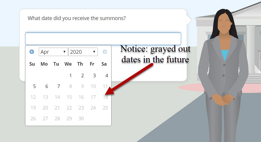
Figure: End user is only shown calendar options within date parameters set by author and can only select dates within that range.
Calendar
A2J Author includes a calendar for the end user to select from when using a date field. The calendar automatically displays when the end user clicks into the date field to begin typing their date answer (see figure below).
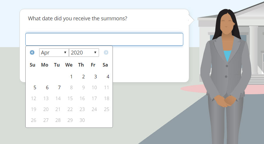
Figure: Calendar displayed to the end user.
Sample Value
Sample values allow the author to enter a value that can be used during testing. Testing an A2J Guided Interview before it goes live can become tedious if the tester has to constantly fill in answers for all of the required fields. By putting in a sample value and clicking “Fill” in Preview Mode, A2J Author will put into the A2J Guided Interview all of the sample values for that page previously created. This allows for quick testing or specialized testing on certain features like Repeat Loops or Advanced Logic. The figure below shows the sample value field filled in on the authoring back end. The second figure below shows the Fill button and the sample value filled into the question in Preview Mode.
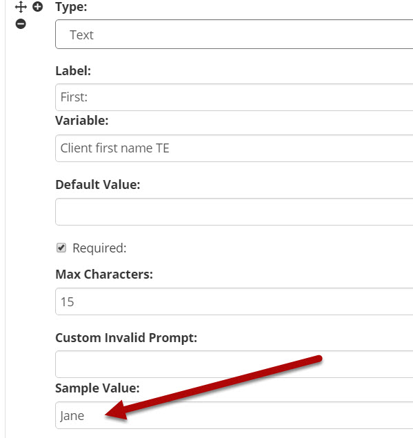
Figure: The Sample Value option in the Fields section of the Question Design Editor.
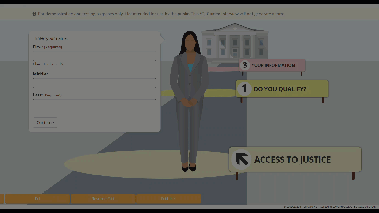
Figure: The Fill button in Preview Mode and the filled in sample value.
Text Fields
There are three different sub-types of text fields: Text, Text (Long), and Text (Pick from list). The three options are pictured in the figure below. The first option is a text field that allows the end-user to enter a single line of text. This type is simply referred to as “Text” in the drop-down Type selection list under the Fields section.
The second type is entitled “Text(Long),” which allows an end-user to type in multiple lines of text. Text (Long) also provides the end-user with the option to enlarge the text box so they can more easily view and edit large amounts of text.
The third text type is “Text (Pick from list),” which allows a end-user to select a text entry from a drop-down menu.
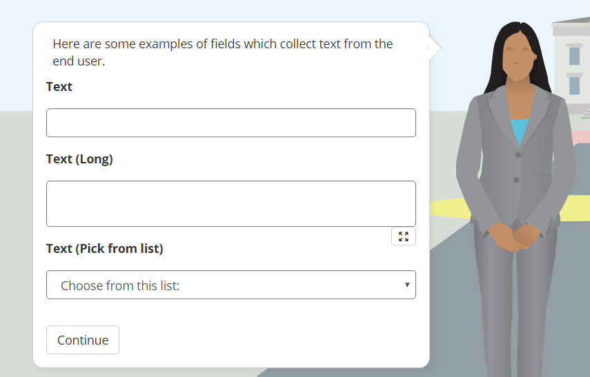
Figure: Preview of Text-type Fields in a Question.
Number Fields
There are six different sub-types of number fields: Number, Number Dollar, Number SSN, Number Phone, Number Zip Code, and Number (Pick from list) (figure below). The purpose for each of these number fields is obvious from their title.
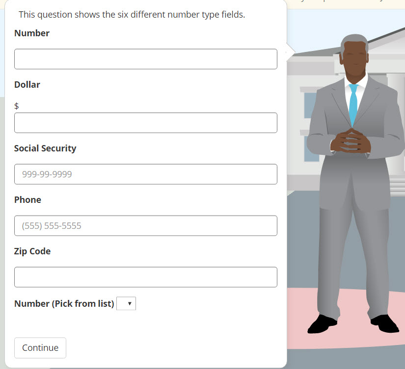
Figure: Six number fields.
The Number (Pick from list) field works similar to the Text (Pick from list) in that it provides the ability to limit the list to a range. The author enters the minimum value and the maximum value. A2J Author will automatically populate the list with the numbers in between those two values (figures below).
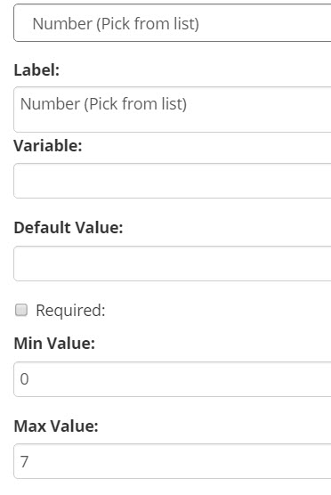
Figure: Author enters min and max values.
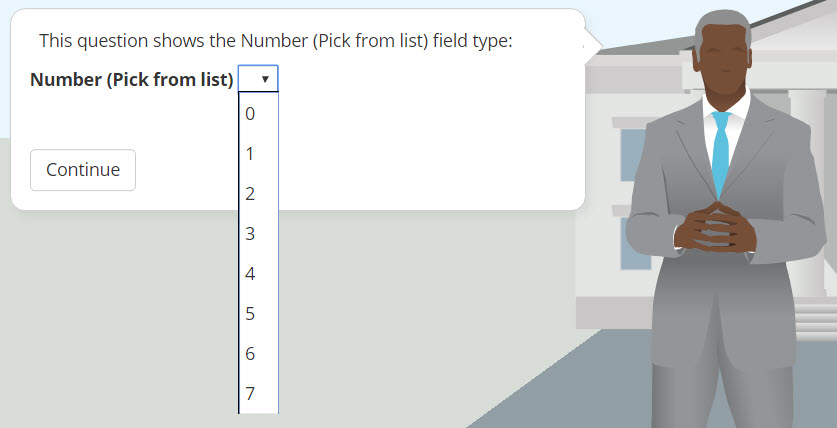
Figure: A2J Author auto populates the list.
Date Fields
The Date field collects a date from the end-user using a fill in box or a graphic calendar. Along with the three common properties (Type, Label, and Variable), the date field properties include: Default Value, Required, Min and Max Values, Show Calendar, Custom Invalid Prompt, and Sample value (figure below). The Limit Values, if they are to be used, must both be populated with a either a date in the “mm/dd/yyyy” format or the function “TODAY.”
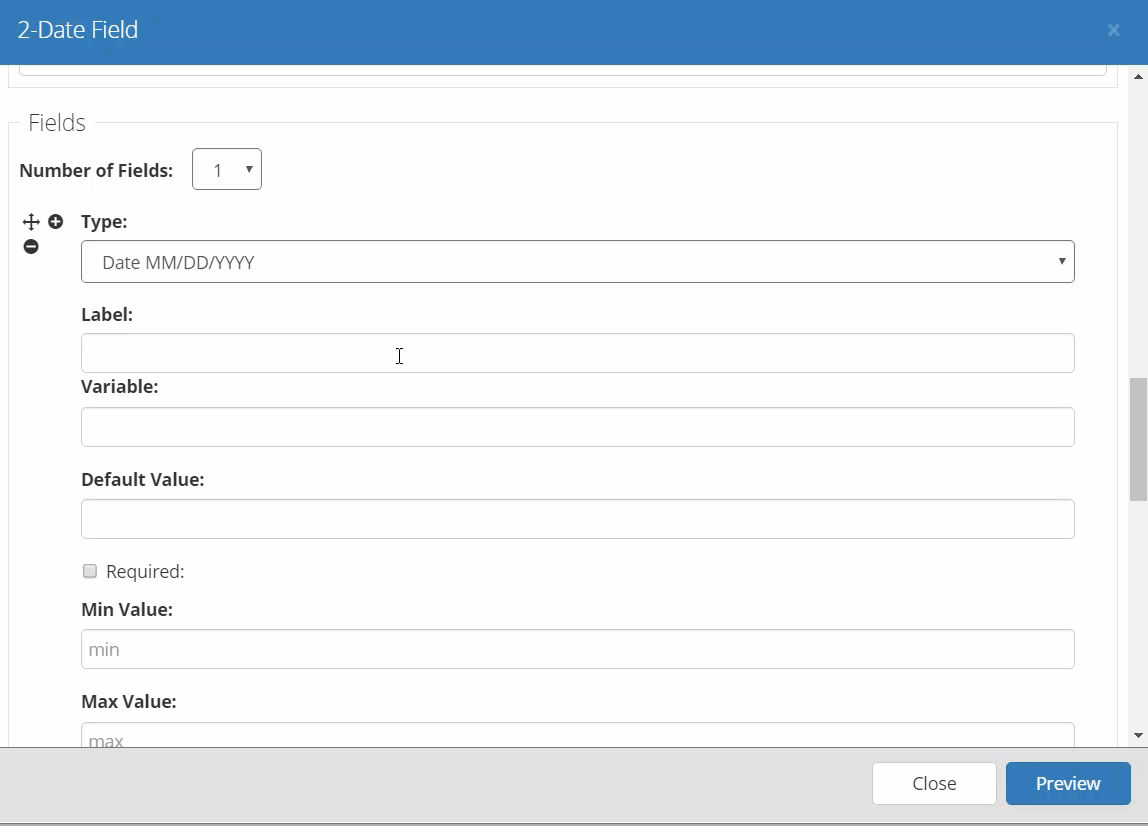
Figure: Date field properties.
A calendar icon appears underneath the date field. If the user clicks on the icon, a larger graphic calendar expands to allow them to pick from. The calendar defaults to the current year and month, unless the “Max value” is set to something less than the current year.
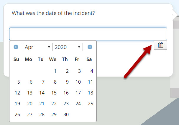
Figure: Graphic Calendar with calendar icon highlighted.
Radio Buttons
There are two different types of radio button fields: Gender and Radio Button. The gender field is used only to collect a gender from the end-user. The value that is placed in the supplied variable is either ‘Male’ or ‘Female’ based upon the end-user’s input. Before December 2019, there was only one way to populate the end user avatar and that was using the Gender field type to ask a user to select either a male or a female avatar. In December 2019, the A2J Author team rolled out the new User Avatar field type and avatar picker. For more information on that, see the User Avatar field type description below. To read about the new avatars, click here. The end user’s response is used to populate the User Avatar for the rest of the Guided Interview. It is recommended that authors include a Learn More explaining to the end user why they are collecting this information if they choose to use the Gender field. By default now all blank A2J Guided Interviews come with the User Avatar question rather than the User Gender question.
The properties for the Gender radio buttons are partially pre-defined (Figure 107). The author can customize the field label. If the author includes the User Gender field and the User Avatar field in an A2J Guided Interview, the User Avatar field selection by the user will determine the avatar. Because the User Gender question is no longer required for populating an end user avatar, the author can decide if the field is required or not if used.
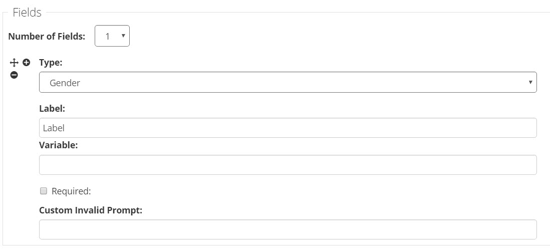
Figure: Gender field properties
The other type of radio buttons is the generic radio button. Radio buttons are used when authors want to provide a selection of choices for the end-user, but need to guarantee that the end user only selects one option, such as in selecting marital status (see figure below).
The radio buttons should be associated with a multiple choice variable type. For each radio button option, use the same variable, but include a different default value to populate that variable if the end user selects that option (second figure below). Therefore, if a series of radio buttons is provided in a question, only one button can be selected.
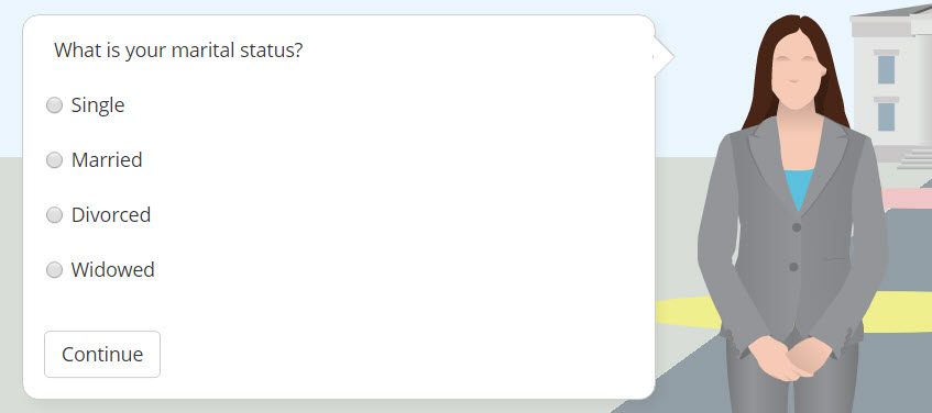
Figure: Radio button example from the end user’s perspective.
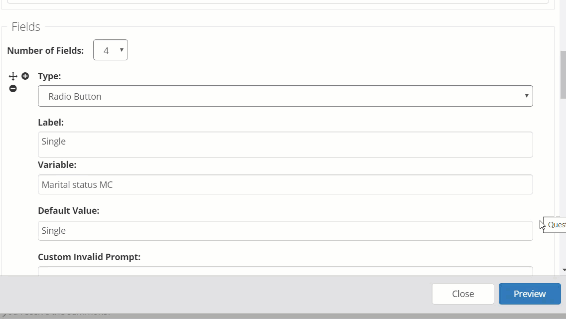
Figure: Radio button properties.
Checkboxes
Checkboxes are used to provide the end-user with the option of selecting multiple values. The Checkbox field, however, is associated with a true/false variable type, not multiple choice. Thus, a checked box has a value of ‘true’ and an unchecked box has a value of ‘false’. It also requires a different true/false variable for each option (see figures below).

Figure: Check box field properties
The author can require the end-user to select a specific option by marking it as “Required”. For example, you have a statement about your A2J Guided Interview not being the same as getting legal advice from an attorney and you require the end user to check the "I agree" checkbox.
A “None of the above” option requires the end-user to pick one of the presented checkbox fields or select the “none of the above” option. It essentially makes the entire question "required", so the user must pick one answer at least (but can pick more than one as well) before they can move on.

Figure: Checkbox “none of the above” example.
User Avatar
The final field type is User Avatar. This is used to populate the question which allows the end user to select their avatar. It comes pre-populated with the necessary elements of the question in a default blank interview. In December 2019, the User Avatar question replaced the User Gender question in default A2J Guided Interviews. If an author is adding this to an A2J Guided Interview created before December 2019, they can select the User Avatar field type and add the variable User Avatar and whatever label they would like.

Figure: User Avatar field properties

Figure: User Avatar field as end users see it.
Field Properties Reference Chart
|
FIELD PROPERTIES |
DESCRIPTION |
|
Type |
There are 15 field types available: Text, Text (Long), Text (Pick from list), Number, Number Dollar, Number SSN, Number Phone, Number Zip Code, Number (Pick from list), Date, Gender, Radio Button, Checkbox, Checkbox (None of the above), User Avatar. A Field Type must be selected for every added field. |
|
Label |
A label which identifies the type of data being collected in the field can be added, if desired. For most Field Types the label will appear to the left of the field. If a label is too long, the field will drop below the label to allow the label to include additional characters, but can be no longer than the width of the question bubble. In the case of the Gender, Radio Button, and Checkbox fields, the label will appear to the right of the radio button or checkboxes. Labels for these types of fields will wrap, allowing for more than one line of text. |
|
Variable |
A variable name must be assigned to every added field. (For more on variable naming conventions, see Appendix C.) The variable type and field type do not have to match. However, a true/false variable type should always be set to either “true” or “false”. |
|
Default Value |
Most field types allow the author to provide a default value for the variable associated with a field. Providing a default value can add efficiency to a Guided Interview (e.g., if it is likely that most end-users will enter “Cook” county, even though the Guided Interview could apply to all of the counties in Illinois, the author of the Guided Interview could default a text list to show Cook County first.) |
|
Required |
All Field Types can be equipped with a validation feature which requires that the end-user complete an entry in the field before moving further in the Guided Interview. To require a question, check the box next to “required.” If “required” is selected, A2J Author® will return a prompt, the text of which can be modified by the author. |
|
Internal/ External List |
The Text (Pick from list) Field Type includes the ability to provide a custom drop-down list (internal list) or attach a pre-formatted (.xml) (external) list. |
|
Limit Value |
Number, Number Dollar, Number(Pick from list), and Date Field Types can have their selections limited by setting the Min or Max values. For Number, Number Dollar and Number(Pick from list) a minimum and maximum number can be chosen to limit the range of numbers that can be entered in the field. For the Date Field, a minimum and maximum date can be chosen to limit the range of dates that can be selected. The “TODAY” function can also be used to limit the date selection. See the subheading Functions in this chapter for more details. |
Field Types Reference Chart
|
FIELD TYPES |
FIELD PROPERTIES |
|||||||
|
Type |
Label |
Variable |
Default Value |
Required |
Internal/ External List |
Order List |
Limit Value |
|
|
Text |
✔ |
✔ |
✔ |
✔ |
✔ |
|
|
|
|
Features: The field will move to the second line as the label for the field gets larger. A label for this field is limited to one line of text. |
||||||||
|
Text (Long) |
✔ |
✔ |
✔ |
✔ |
✔ |
|
|
|
|
Features: The field will move to the second line as the label for the field gets larger. A label for this field is limited to one line of text. The end-user can enlarge the text box. |
||||||||
|
Text (Pick from list) |
✔ |
✔ |
✔ |
✔ |
✔ |
✔ |
✔ |
|
|
Features: The field will move to the second line as the label for the field gets larger. A label for this field is limited to one line of text. |
||||||||
|
Number |
✔ |
✔ |
✔ |
✔ |
✔ |
|
|
✔ |
|
Features: The field will move to the second line as the label for the field gets larger. A label for this field is limited to one line of text. This field will automatically reject an entry of text. |
||||||||
|
Number Dollar |
✔ |
✔ |
✔ |
✔ |
✔ |
|
|
✔ |
|
Features: The field will move to the second line as the label for the field gets larger. A label for this field is limited to one line of text. This field will automatically reject an entry of text. |
||||||||
|
Number SSN |
✔ |
✔ |
✔ |
✔ |
✔ |
|
|
|
|
Features: The field will move to the second line as the label for the field gets larger. A label for this field is limited to one line of text. This field will automatically reject an entry of text. |
||||||||
|
Number Phone |
✔ |
✔ |
✔ |
✔ |
✔ |
|
|
|
|
Features: The field will move to the second line as the label for the field gets larger. A label for this field is limited to one line of text. This field will automatically reject an entry of text. |
||||||||
|
Number Zip Code |
✔ |
✔ |
✔ |
✔ |
✔ |
|
|
|
|
Features: The field will move to the second line as the label for the field gets larger. A label for this field is limited to one line of text. This field accepts text and numerals. |
||||||||
|
Number (Pick from list) |
✔ |
✔ |
✔ |
✔ |
✔ |
|
✔ |
✔ |
|
Features: The field will move to the second line as the label for the field gets larger. A label for this field is limited to one line of text.
|
||||||||
|
Date |
✔ |
✔ |
✔ |
✔ |
✔ |
|
✔ |
✔ |
|
Features: Only numbers can be entered into this field type. The field provides three separate drop-down menus from which to select, month, day, and year. The range can be limited using the function “TODAY” as either the minimum or maximum value. The field will move to the second line as the label for the field gets larger. |
||||||||
|
Gender |
✔ |
✔ |
✔ |
|
✔ |
|
|
|
|
Features: The Gender field is pre-formatted as a set of two radio buttons: one with the label of female, and the other male. A label for the group of buttons entitled “Gender” is included. It should retain the variable “User Gender” in order to set the gender of the User’s avatar. |
||||||||
|
Radio Button |
✔ |
✔ |
✔ |
✔ |
✔ |
|
|
|
|
Features: Any variable associated with this Field type is defaulted to a Multiple Choice variable. Only one selection from a group is allowed. The label for this field appears to the right and will wrap. |
||||||||
|
Checkbox |
✔ |
✔ |
✔ |
|
✔ |
|
|
|
|
Features: Any variable associated with this Field type is defaulted to a True/False variable. The label from this field appears to the right of the checkbox and will wrap. |
||||||||
| User Avatar | Used to populate the end user's avatar. Not required. Comes with new A2J Guided Interviews by default. | |||||||